聰明不如鈍筆
총명불여둔필

어떤 색을 어떻게 섞어 써야 할지 모르는 일이 꼭 파워포인트(PPT) 자료를 만들 때만 생기는 건 아닙니다.
R로 그래프를 그릴 때도 엉뚱한 색깔을 썼다 가는 한 땀, 한 땀 열심히 그린 그래프가 쳐다 보기 싫은 존재로 변할 수도 있습니다.
색상 선택이 고민일 때 많은 R 사용자가 보통 RColorBrewer 패키지를 선택합니다.
이 선택이 잘못이라는 얘기는 절대 아닙니다.
그래도 어떤 대안이 있다면 반드시 그 대안의 대안도 있게 마련.
그런 이유로, 자랑스레, colorspace 패키지를 여러분께 소개해 드립니다 -_-)/

colorspace는 기본적으로 RColorBrewer 확장판이라고 생각하시면 됩니다.
완전히 똑같지는 않지만 colorspace에는 △RColorBrewer △rcartocolor △scico △viridis 패키지에 들어 있는 팔레트가 들어 있습니다.
일단 어떤 팔레트가 들어있는지 확인하고 싶을 때는 hcl_palettes() 함수를 쓰면 됩니다.
이때 hcl은 색의 3요소 △색상(hue) △채도(chroma) △명도(luminance)를 줄인 말입니다.

노파심에 말씀드리면 # 뒤에 16진수가 나오는 이 이상한 조합을 가지고 '웹 색상'을 지정하는 겁니다.
색상 채도 명도가 뭔지 감을 잡으셨을 테니 color 패키지를 (설치하고) 불러온 다음 hcl_palettes() 함수를 직접 써보겠습니다.
아, 물론 늘 그렇듯 tidyverse 패키지도 함께 (설치하고) 불러오셔야 합니다.
#install.packages('tidyverse')
library('tidyverse')
## -- Attaching packages --------------------------------------- tidyverse 1.3.1 --
## v ggplot2 3.3.2     v purrr   0.3.4
## v tibble  3.0.3     v dplyr   1.0.2
## v tidyr   1.1.2     v stringr 1.4.0
## v readr   1.3.1     v forcats 0.5.0
## -- Conflicts ------------------------------------------ tidyverse_conflicts() --
## x dplyr::filter() masks stats::filter()
## x dplyr::lag()    masks stats::lag()
#install.packages('colorspace')
library('colorspace')hcl_palettes()## HCL palettes ## ## Type: Qualitative ## Names: Pastel 1, Dark 2, Dark 3, Set 2, Set 3, Warm, Cold, Harmonic, Dynamic ## ## Type: Sequential (single-hue) ## Names: Grays, Light Grays, Blues 2, Blues 3, Purples 2, Purples 3, Reds 2, ## Reds 3, Greens 2, Greens 3, Oslo ## ## Type: Sequential (multi-hue) ## Names: Purple-Blue, Red-Purple, Red-Blue, Purple-Orange, Purple-Yellow, ## Blue-Yellow, Green-Yellow, Red-Yellow, Heat, Heat 2, Terrain, ## Terrain 2, Viridis, Plasma, Inferno, Rocket, Mako, Dark Mint, ## Mint, BluGrn, Teal, TealGrn, Emrld, BluYl, ag_GrnYl, Peach, ## PinkYl, Burg, BurgYl, RedOr, OrYel, Purp, PurpOr, Sunset, ## Magenta, SunsetDark, ag_Sunset, BrwnYl, YlOrRd, YlOrBr, OrRd, ## Oranges, YlGn, YlGnBu, Reds, RdPu, PuRd, Purples, PuBuGn, PuBu, ## Greens, BuGn, GnBu, BuPu, Blues, Lajolla, Turku, Hawaii, Batlow ## ## Type: Diverging ## Names: Blue-Red, Blue-Red 2, Blue-Red 3, Red-Green, Purple-Green, ## Purple-Brown, Green-Brown, Blue-Yellow 2, Blue-Yellow 3, ## Green-Orange, Cyan-Magenta, Tropic, Broc, Cork, Vik, Berlin, ## Lisbon, Tofino
일단 결과를 보시면 colorspace 패키지가 △정성적(qualitative) △순차적(sequential) △발산적(diverging) 형태로 팔레트를 나누고 있다는 사실을 알 수 있습니다.
누구나 이런 글만 보고 한 번에 무슨 뜻인지 알아들을 수 있다면 세상에 백문불여일견(百聞不如一見)이라는 말이 없었을 겁니다.
hcl_palettes() 함수 안에 plot = TRUE 옵션을 주면 팔레트 예시 이미지가 나타납니다.
hcl_palettes(plot = TRUE)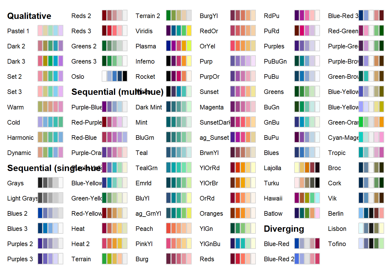
hcl_palettes() 함수 안에 옵션을 주면 특성별 팔레트를 따로 따로 불러오는 것도 가능합니다.
hcl_palettes('qualitative', plot = TRUE)
hcl_palettes('sequential', plot = TRUE)
hcl_palettes('diverging', plot = TRUE)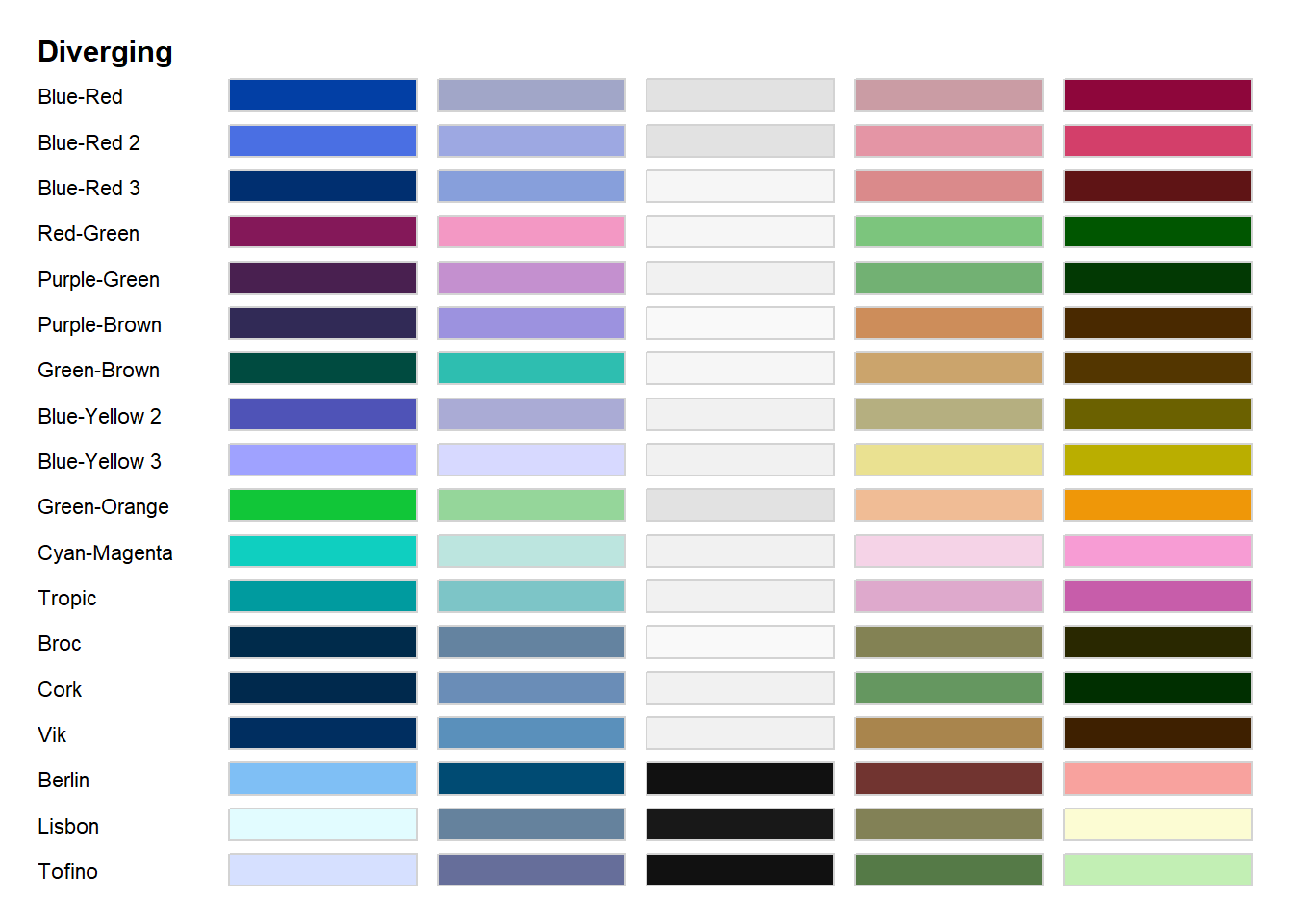
지금까지 계속 각 팔레트별로 색깔을 다섯 개씩 보여주는데 물론 이 숫자도 바꿀 수 있습니다.
예컨대 정성적인 그러니까 각 항목을 서로 구분하는 게 목적인 색깔 7개를 Dark 3 팔레트에서 꺼내는 코드는 이렇게 쓰면 됩니다.
qualitative_hcl(7, palette = 'Pastel 1')## [1] "#FFC5D0" "#EFCFAF" "#C9DBAA" "#A2E2C6" "#9EDFE9" "#C8D3FC" "#F2C7F1"
당연히 순차적(sequential)이거나 발산적(diverging)인 색깔 코드를 원하는 숫자 만큼 확인하는 것도 가능합니다.
sequential_hcl(7, palette = 'Purple-Blue')## [1] "#6B0077" "#724E95" "#7C7BB2" "#8DA3CA" "#A7C6DD" "#C8E2EB" "#F1F1F1"
diverging_hcl(7, palette = 'Blue-Red')## [1] "#023FA5" "#7D87B9" "#BEC1D4" "#E2E2E2" "#D6BCC0" "#BB7784" "#8E063B"
이렇게 얻은 색상 코드는 ggplot 그래프에 수동으로 적용할 수도 있고 colorspace에 들어 있는 함수를 활용해 자동으로 적용할 수도 있습니다.
원래 ggplot2 패키지에서 특정한 기준에 따라 자동으로 색깔을 적용할 때는 scale_<aesthetic>_<color scale> 코드를 씁니다.
예를 들어 scale_fill_manual() 함수를 쓰면 수동으로 = 색깔을 마음대로 골라 칠할 수 있습니다.
colorspace에서는 여기에 datatype까지 붙어 함수 길이가 더욱 길어지지만 기본적인 사용법은 똑같습니다.
datatype이라는 건 자료가 이산적(discrete)인지 연속적(continuous)인지를 나타냅니다.
| aesthetic | datatype | color scale | function |
| fill | discrete | qualitative | scale_fill_discrete_qualitative() |
| sequential | scale_fill_discrete_sequential() | ||
| diverging | scale_fill_discrete_diverging() | ||
| continuous | qualitative | scale_fill_continuous_qualitative() | |
| sequential | scale_fill_continuous_sequential() | ||
| diverging | scale_fill_continuous_diverging() | ||
| color | discrete | qualitative | scale_color_discrete_qualitative() |
| sequential | scale_color_discrete_sequential() | ||
| diverging | scale_color_discrete_diverging() | ||
| continuous | qualitative | scale_color_continuous_qualitative() | |
| sequential | scale_color_continuous_sequential() | ||
| diverging | scale_color_continuous_diverging() |
실제로 이 함수를 어떻게 활용하는지 이제부터 펭귄(penguin) 데이터 세트를 가지고 알아보겠습니다.

원래 R에서 예제 데이터가 필요할 때 제일 많이 쓰는 건 iris 데이터입니다.
iris 데이터에는 그 유명한 로널드 피셔(1890~1962)가 측정하고 수집한 붓꽃 꽃받침(sepan)과 꽃잎(petal) 길이와 폭이 들어 있습니다.
문제는 피셔가 우생학적 관점에서 자유로울 수 없는 인물이라는 점입니다.
미국에서 인종차별에 반대하는 움직임이 거세지면서 대안으로 등장한 게 바로 펭귄 데이터입니다.
펭귄 데이터에는 △아델리 △젠투 △턱끈 펭귄 신체적 특징을 수집한 자료가 들어 있습니다.

R에서 펭귄 데이터 세트를 활용하려면 palmerpenguins 패키지를 설치하고 불러오셔야 합니다.
#install.packages('palmerpenguins')
library('palmerpenguins')
그리고 그냥 penguins라고 입력하면 우리가 쓸 데이터를 확인할 수 있습니다.
penguins## # A tibble: 344 x 8 ## species island bill_length_mm bill_depth_mm flipper_length_mm body_mass_g ## <fct> <fct> <dbl> <dbl> <int> <int> ## 1 Adelie Torgersen 39.1 18.7 181 3750 ## 2 Adelie Torgersen 39.5 17.4 186 3800 ## 3 Adelie Torgersen 40.3 18 195 3250 ## 4 Adelie Torgersen NA NA NA NA ## 5 Adelie Torgersen 36.7 19.3 193 3450 ## 6 Adelie Torgersen 39.3 20.6 190 3650 ## 7 Adelie Torgersen 38.9 17.8 181 3625 ## 8 Adelie Torgersen 39.2 19.6 195 4675 ## 9 Adelie Torgersen 34.1 18.1 193 3475 ## 10 Adelie Torgersen 42 20.2 190 4250 ## # ... with 334 more rows, and 2 more variables: sex <fct>, year <int>/pre>
palmerpenguins 패키지에는 penguins 이외에 penguins_raw 데이터도 들어 있으니 필요에 따라 쓰셔도 됩니다.
penguins_raw## # A tibble: 344 x 17 ## studyName `Sample Number` Species Region Island Stage `Individual ID` ## <chr> <dbl> <chr> <chr> <chr> <chr> <chr> ## 1 PAL0708 1 Adelie Pengu~ Anvers Torge~ Adult,~ N1A1 ## 2 PAL0708 2 Adelie Pengu~ Anvers Torge~ Adult,~ N1A2 ## 3 PAL0708 3 Adelie Pengu~ Anvers Torge~ Adult,~ N2A1 ## 4 PAL0708 4 Adelie Pengu~ Anvers Torge~ Adult,~ N2A2 ## 5 PAL0708 5 Adelie Pengu~ Anvers Torge~ Adult,~ N3A1 ## 6 PAL0708 6 Adelie Pengu~ Anvers Torge~ Adult,~ N3A2 ## 7 PAL0708 7 Adelie Pengu~ Anvers Torge~ Adult,~ N4A1 ## 8 PAL0708 8 Adelie Pengu~ Anvers Torge~ Adult,~ N4A2 ## 9 PAL0708 9 Adelie Pengu~ Anvers Torge~ Adult,~ N5A1 ## 10 PAL0708 10 Adelie Pengu~ Anvers Torge~ Adult,~ N5A2 ## # ... with 334 more rows, and 10 more variables: Clutch Completion <chr>, ## # Date Egg <date>, Culmen Length (mm) <dbl>, Culmen Depth (mm) <dbl>, ## # Flipper Length (mm) <dbl>, Body Mass (g) <dbl>, Sex <chr>, ## # Delta 15 N (o/oo) <dbl>, Delta 13 C (o/oo) <dbl>, Comments <chr>
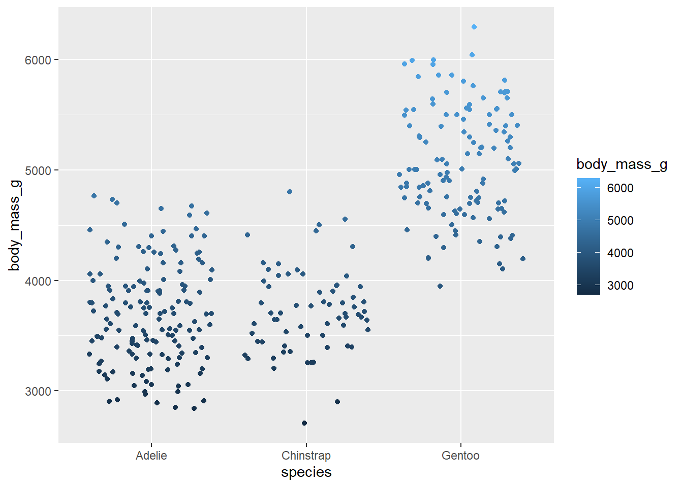
일단 각 펭귄 종류별로 몸무게(body_mass_g)에 따라 점 색깔이 변하도록 기본적인 그래프를 그려보겠습니다.
penguins %>%
  ggplot(aes(x = species,
             y = body_mass_g,
             color = body_mass_g)) +
  geom_jitter()
## Warning: Removed 2 rows containing missing values (geom_point).
이제 colorspace 패키지를 써서 점 색깔을 바꿔보도록 하겠습니다.
몸무게는 연속적인(continuous) 자료입니다. 팔레트 역시 순차적(sequential) 형태여야 합니다.
따라서 scale_color_continuous_sequential() 함수를 쓰면 됩니다.
이번에는 'Teal' 팔레트를 써서 색깔을 지정하겠습니다.
경고 메시지가 지겨우니 drop_na() 함수로 불필요한 데이터를 지워줍니다.
penguins %>%
  drop_na() %>%
  ggplot(aes(x = species,
             y = body_mass_g,
             color = body_mass_g)) +
  geom_jitter() +
  scale_color_continuous_sequential(palette = 'Teal')
잘 나왔는데 어쩐지 아래 쪽 색상이 너무 연하다는 생각이 듭니다.
이럴 때는 그냥 시작(begin)과 끝(end) 지점을 지정해 주기만 하면 됩니다.
penguins %>%
  drop_na() %>%
  ggplot(aes(x = species,
             y = body_mass_g,
             color = body_mass_g)) +
  geom_jitter() +
  scale_color_continuous_sequential(palette = 'Teal',
                                    begin = .2,
                                    end = .8)
이 코드로는 몸무게가 무거울수록 짙은 색깔이 나옵니다.
때로는 색깔 방향을 반대로 바꾸고 싶을 수도 있습니다.
이번 자료를 예로 들면 몸무게가 가벼울수록 짙은 색으로 나타내고 싶을 때가 있는 것.
이때는 그냥 시작과 끝 지점 숫자만 뒤집으면 됩니다.
penguins %>%
  drop_na() %>%
  ggplot(aes(x = species,
             y = body_mass_g,
             color = body_mass_g)) +
  geom_jitter() +
  scale_color_continuous_sequential(palette = 'Teal',
                                    begin = .8,
                                    end = .2)
계속해서 이산형 데이터를 기준으로 색깔을 바꾸는 방법을 알아보겠습니다.
이산형(離散形)은 종류를 구분하는 데이터라고 생각하시면 편합니다. 여기서는 펭귄 종류가 여기 해당합니다.
이산형 데이터에는 물론 정성적(qualitative) 팔레트 형태가 어울립니다.
결국 scale_*_discrete_qualitative() 함수를 쓰면 원하는 결과를 얻을 수 있습니다.
종류별 몸무게를 히스토그램으로 그리고 'Cold' 팔레트를 써서 색을 칠하겠습니다.
penguins %>%
  drop_na() %>%
  ggplot(aes(x = body_mass_g,
             fill = species)) +
  geom_histogram(bins = 10, color = 'white', alpha = .75) +
  scale_fill_discrete_qualitative(palette = 'Cold')
이번에 색깔을 바꾸고 싶을 때는 그냥 c() 함수 안에 순서를 지정하면 됩니다.
예를 들어 앞서 쓴 코드 안에 c(2, 3, 1)이라고 옵션을 주면 한 칸씩 색깔을 앞당긴 결과를 얻을 수 있습니다.
penguins %>%
  drop_na() %>%
  ggplot(aes(x = body_mass_g,
             fill = species)) +
  geom_histogram(bins = 10, color = 'white', alpha = .75) +
  scale_fill_discrete_qualitative(palette = 'Cold',
                                   order = c(2, 3, 1))
아, ggplot2로 그래프를 그리는 과정 자체가 잘 이해가 가지 않으시는 분이 계시다면 '최대한 친절하게 쓴 R로 그래프 그리기(feat. ggplot2)' 포스트가 도움이 될 수 있습니다.
이 포스트가 그래프 색깔 선택으로 고통받고 계신 분들께 조금이라도 도움이 되기를 바랍니다.
그럼 모두들 Happy Tidyversing -_-)/
댓글,